Friday, February 26, 2010

Table Number Inspiration

One of my best friends is getting married in May, and we've been talking about different options for table numbers.  With all the stress of planning the guest list and making seating charts, the table numbers should be fun and creative...but more importantly easy!  Most of these are DIY, and I love how they all incorporate the style and feeling of the individual wedding.  From classic to funky, there are so many options to suit everyone's taste.

This is just chalkboard paint on a plain glass candle jar, with the number written in white chalk.

The simple black picture frame to the left side of the image allows guests to see the number without taking away from the place settings.

These are so elegant and could be hand drawn or printed, then cut into ovals.

So simple and cute in a distressed picture frame.

For a nest/bird-themed wedding.  I love the clothes pin stuffed into the soft moss to hold up the number.

How about table letters?  These look like they are from an old children's alphabet book.

This simple white number can be seen from a distance to make it easier on your guests.

This is just a tin can painted on the inside with a bright color.  An awe was used to punch out holes to create the number.  

This table number is soft and elegant.

The bride cross-stitched this table number.

It looks like this number was painted or stuck onto a porcelain rectangle.

I think this one is my favorite.  I love the strong graphic font on a white background with white linens.  So clean and crisp.

I love the rustic look of these old metal house numbers hung from a simple wooden frame.

More metal numbers were used to give this wedding a contemporary fun look.

These felt flag numbers remind me of a high school letter jacket.  Perfect for high school sweethearts!

This would be a great, simple option for a reception, especially one at a vineyard.

You could use this idea with lemons, oranges, pears, anything!

Another one of my favorites...a simple burlap winebag with the number stenciled on in the same color as the flower and ribbon.

Another simple option.

This option uses vintage wooden stamps.

This number was painted or glued onto an old milk jug.

Miniature chalk boards stuck into the floral centerpieces serve as the table numbers here.

Wooden logs cut into different heights serve as a base for these table numbers.  Just a simple slit cut into the log allows the cardstock to stand up.

Thursday, February 25, 2010

Beautiful Stationary Package

Mae Mae Paperie features tons of gorgeous stationary, invitations, business cards, and other paper goods that all have a fresh, clean graphic style.  I especially love their package created for Lindye Galloway Events.  The apple green and pristine gray give just enough color to catch your eye but still seem clean.  I love the background trellis pattern and how they used graph paper to line the envelopes.  And their choice of which fonts to mix and match coordinate so well together.


Lindye is a wedding and event planner who makes every little detail perfect.  Check out some of the photos from her website.


Wednesday, February 24, 2010

Finding the Flavor...

Wedding blogs have been such a great source of inspiration to me while trying to nail down the feeling and flavor of this wedding.  Here are some of the latest photos from my "Wedding Inspiration" folder to share with you guys!


{Images courtesy of Southern Wedding, Snippet and Ink, Grey Likes Weddings, The Knot, 100 Layer Cake, and others}

Tuesday, February 23, 2010

Room of the Week

This room allows sunlight to pour in and enhances the wood floor. The crown moulding and architectural features around the mantle make this simple space seem rich.  I love the built in window seat and the storage underneath for fire wood.


{Image courtesy of Where the Sidewalk Begins}

Thursday, February 18, 2010

Artist Spotlight: Amanda Stone Talley

"Painting, for me, is about translating the activity and movement of the outside world into a vocabulary of paint and line." -Amanda Talley

Amanda Stone Talley got a Bachelor of Arts from Mary Baldwin College (near my hometown!) and got a Masters of Fine Arts in Painting from Savannah College of Art & Design. Her paintings are evocative and fresh, yet have the crispness of Charles Rennie Mackintosh's Rose. I love her color palettes and wet quality of her work.


To see more, visit her website.  Make sure you check out her blog, too!

Sustainability Fact of the Week

Sustainability means something different to almost everyone. Buying local, growing your own food, recycling, and purchasing goods made from natural ingredients are all great steps that we can take in our immediate community to catalyze a more sustainable future.
Perhaps the best way to build a more sustainable lifestyle is to talk about it, to get the word out, and to learn more. Soak up the facts about climate change, global resources, and alternative oil options. Know the pros and cons about natural ingredients and LEED. Each week or two I will feature a sustainability fact to help inform and know what you can do to help. I by no means know everything there is to know about sustainability, but I will find legitimate sources and sites to help us learn together. If you have any tips, comments, or suggestions, I'd love to hear them!

Fact of the Week:
According to the EPA, the United States produces approximately 220 million tons of garbage each year, the equivalent of burying more than 82,000 football fields six feet deep in compacted garbage. The National Recycling Coalition reports that, on average, every American throws away more than seven pounds of garbage a day.


Here are some other great sites to check out to learn more:

{Images courtesy of My Trash Can,  Ocean World, & Recycle Raccoon}

Wednesday, February 17, 2010

Leslie Thomson Photography

I discovered Leslie Thomson's photography through the blog A Room Somewhere.  Her images evoke a nostalgic feeling of the moments that you can't put into words.  They have a hazy quality and focus on something beautiful in the foreground with a blurred background.  You can buy prints of her photos on Etsy and see her photostream on flickr. I chose a few that evoke the snowy feeling of winter that we've all experienced lately.


Tuesday, February 16, 2010

Wedding Invitations

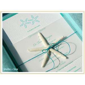
The search for wedding invitation inspiration has been ongoing ever since I started thinking about the wedding.  I am drawn to graphically strong invitations that are simple and clean.  I also love it when the invitation, response card, save the date, thank you note, and program all read as a package with a continuing element that carries them together.  A nautical feel with a bold pattern would be the perfect style for a simple southern wedding.  Here are some of the invitations that have inspired me the most.


Here is the invitation that I designed for the wedding.  It will probably change, but at least it gives the overall style that I'm going for.  Feel free to leave comments and let me know what you think about it!