Saturday, October 31, 2009

Beach Week: Citrus Beach Scenes

This juicy orange color works great for a beachy cottage.


Using tangerine just as the accent for pillows keeps the room fresh without overwhelming the space.


I love how they used buoys here to create an architectural exterior element. And the orange-juice color on the house is so bold!


Even down to the small details, orange can be such a fresh statement, especially when paired with this cool blue.


{Images courtesy of Coastal Living}

It's Beach Week!

All this week I will be featuring images from Coastal Living Magazine. This should get us all inspired and out of this bleak cloudy weather we've been having lately! So grab your sunscreen and your favorite oversized sunglasses, we're off to Beach Week!

Here are some beautiful beach house kitchens. So bright and sunny with crisp white walls.


Friday, October 30, 2009

Wedding Blog: The Bride's Cafe

I found a beautiful wedding blog today, so if any of you are in need of inspiration be sure to check it out The Bride's Cafe.


This one is my absolute favorite. Gorgeous in the daylight with the shadows pouring in, but probably even more beautiful at night with the chandeliers lit.


Dallas Center for Performing Arts: Wyly Theater

The Wyly Theater in Dallas is an outstanding example of architecture. I love how the metal facade appears to be trickling down the outside in perfectly vertical streams. The vertical lines seem so light opposed to the heavy metallic form peeking out from underneath. Fieldtrip anyone?


Thursday, October 29, 2009

Perfect!


Check out this gorgeous photo courtesy of Kirpernicus on flickr. A perfect shot for this crisp autumn season.

More Antlers

I think I am obsessed with antler chandeliers. They are masculine, but their natural curves give them a feminine touch. And the colors in this room are certainly me, poppy, chocolate, ivory, and gray!

{Image courtesy of Metropolitan Home}

Wednesday, October 28, 2009

{International} Room of the Week

This room is beautifully framed by two dramatic doors and a tall, gently curving archway. The moss green of the ceiling compliments the deep reds and browns featured throughout the room. I even like the turquoise text box paired with this image, an example of an uncommon color palette.{Image courtesy of Metropolitan Home}

Watercolor Wednesday!

A lot of you have seen the autumn watercolor painting on my desktop background and asked where I found it. I found it last year on a random google image search, but I hadn't written down where I had gotten it from. So I found it again just the other day, along with many other watercolors by the same artist. Please check this artist out on flickr, his work is amazing.

So each Wednesday I will plan on featuring a different painting for your viewing pleasure. Enjoy!

Tuesday, October 27, 2009

Unique Rendering Style

Although this is a photograph, the simplicity of it causes it to look like an architectural rendering. I think it would be really neat to create a moving silhouette, like the one showed below, into an interior perspective. It would really make the space seem like it was being used, and the person would look like he/she was moving through the space without being too distracting.{Image courtesy of Metropolitan Home}

Song of the Moment

What a perfect classic song for a rainy day like today? "Raining on Sunday" by Keith Urban

{Image courtesy of xen0flex on flickr}

Monday, October 26, 2009

Retail & Branding

Some beautiful examples of branded retail spaces were featured in the October issue of Metropolis Magazine. The rich, regal jewel tones in the Godiva Store tempt the shopper in. The eggplant hue carries over into the Max Mara store, where the floor-to-ceiling windows make the boundaries between interior and exterior disappear.


{Images courtesy of Metropolis Magazine}

Sunday, October 25, 2009

Song of the Moment

Carolina, by Eric Church...a simply beautiful song


{Image courtesy of flickr}

Wonderful Wedding Weekend

Don't we all just love weddings? The look in the groom's eyes, the guests mingling outside in the sun before the ceremony, the music as everyone stands and watches the bride walk down the aisle. This weekend I had the privilege of attending a beautiful wedding, and I just wanted to share some gorgeous wedding photography that inspires me.


{All images courtesy of unknown}

Thursday, October 22, 2009

Need a change of Scenery?

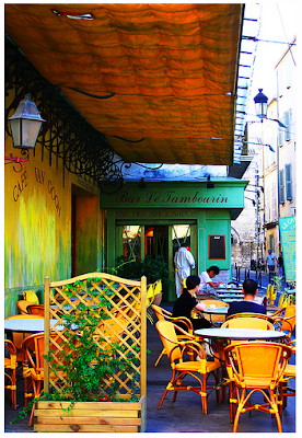
I love how this colorful photograph transports you to a Paris street, crowded and bustling with cafe's and people. Could this have been the cafe that inspired Van Gogh's 'Cafe at Night' Painting? All I know is that I would love to be sipping on a cup of coffee there right now.

{Image courtesy of unknown}

Designing with Ceilings

There is something simple but beautiful about using ceilings to design a space. These images that Lisa showed us in Building Systems not only help recap what different types of ceilings there are, but also inspire us to make the ceilings of our spaces a design statement.


And some other images to get your creativity flowing...


Song of the Moment

Shall we feature another song by my all-time favorite, Dierks Bentley? Feel that Fire


{Image courtesy of Getty Images}

Contemporary Residential Interior Designer

Need some inspiration? Check out Robert Stilin's residential interiors for a clean, contemporary feel created with warm woods and rich textures. His designs are the perfect balance of masculine and feminine.


Wednesday, October 21, 2009

Room of the Week

The low furniture and tall bright walls balance out this gorgeously stylish living area.

{Image courtesy of Habitually Chic}

Tuesday, October 20, 2009

I've Just Died & Gone to Heaven

How did I just find out about this? I've just met the love of my life, and his name is Jeremiah Goodman. He's an artist, and guess what he paints? INTERIORS. And guess what he paints with? WATERCOLORS. It's okay if you fall in love with him too, that's why I'm sharing these images with you!