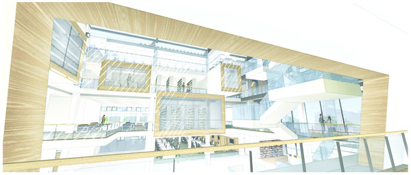
Jessica's concept was based on Richmond's historic railways, echoed by parallel wooden railroad ties that enveloped her space.
Jamie used wayfinding & directionality as the main design aspect of her interior. Simple white wrapping structures carried the viewer throughout the space, while digital motion-sensored walls encouraged interaction between the individual and the space.
A curving form inspired by the shape of eye glasses was the main aspect of Liz's design. Individuals could interact with the form and become the action that occurs within "lenses" the shape created.
Morgan's design created built-in coves and niches that the reader could interact with, making the idea of the traditional library become more of an individual experience.
Molly's design featured a series of neutral cantilevered spaces that aim to provide each reader with a different individualistic experience based on the idea of phenomenology.
My design's goal was to emulate an exterior landscape, featuring floor levels based on different aspects of a horizon and a cantilevered treehouse cafe.


No comments:
Post a Comment