Wednesday, September 30, 2009
J. Crew's New Looks
I love how these layered looks from j.crew's new catalog combine colors not commonly put together. I'd gladly wear any of these outfits!
Tuesday, September 29, 2009
Beautiful Page Layout


 This magazine layout is so clean and simple, yet still makes a strong graphic statement. The thin white margins in between the pictures help keep it clean while incorporating the negative white space of the page into the composition. Lovely layout: so simple, yet so striking!
{Image courtesy of unknown}
Monday, September 28, 2009
Kate Spade's Interior
We all love kate spade handbags, and the interiors of her stores, but now we finally get to see pictures of her New York apartment! So sophisticated, even the bright colors and bold patterns seem refined. See the whole article at Mrs. Blandings blog.
Sunday, September 27, 2009
Make Your Inspiration Board!
With all this talk about inspiration boards lately I decided it was time for the first interactive post. I would love to see all of your pictures and know what inspires you. Drag either the cork board image or the magnetic board onto your desktop, open it with photoshop, and start placing images and photographs that you love. Use the transform tool to rotate your photos so they look like they are placed on a real bulletin board. You can even use 1 larger image to give your board a background. Save your creation as a jpeg and email it to me at lrich07@vt.edu by October 5th. On the 6th I will post everyone's inspiration boards!
I took a stab at creating one, and thought it turned out well. Feel free to show me up though!
Choose either the cork board or the magnetic board to start your own!
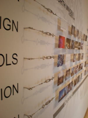
New Display Technique
I love how these photos are displayed. This installation, at the Taubman Museum, Roanoke, shows the architect's process of building the Taubman, as well as other buildings. The installation features 5 rows of taught metal wire that sticks off the wall about 2 inches. Each row is labeled with a stage of the design process, design, tools, installation, etc. Simple 4x6 photographs are hung from the wire in a timeline-like fashion. Above the photos right below the ceiling are the architect's sketches. So the viewer not only gets a feel for the steps of the process, but is also surrounded by images as they circulate around the room. I'd love to try a simpler version of this in a studio space or in an office-what a great way to make simple 4x6's look so professional.
Friday, September 25, 2009
More Inspiration Boards
Design for Mankind featured a series a while ago on monthly inspiration boards. They are in pdf format, and you can download them here. Just scroll down and click on the inspiration montly e-zine link to download all 3! Enjoy!
Quote of the day
"If you're going to fail, fail miserably"
 You can check out Isaac Mizrahi's collections on his website. There is a cool link on his website to diiferent inspiration boards, too. You can even build your own!
-Isaac Mizrahi
I love this quote because it makes me feel confident to try new things and make me think out of the box. It tells me that its okay if I try something bold in a design, and if it doesn't work out, then I will learn from it and move on. I would rather fail doing something bold and new, rather than fail doing something typical and uncreative.
 You can check out Isaac Mizrahi's collections on his website. There is a cool link on his website to diiferent inspiration boards, too. You can even build your own!
Thursday, September 24, 2009
Breakfast for a long day
It's going to be a long day, so a good breakfast is key. Try a pumpkin muffin in a mug with a side of strawberries. Don't forget the Hazelnut coffee to go with it!
Wednesday, September 23, 2009
Room of the Week
One of my goals in studio right now is to use more color in my spaces, not just neutrals. I think this interior does a great job of grabbing you and bringing you in by using an unexpected accent color. Who knew mustard and pink could be so appealing?
Antlers in Interiors
So Chris loves to hunt, and I have this awful vision of my future living room with some tacky stuffed deer on the wall. But these images show a few tasteful ways to decorate with antlers. These would be good compromises right?
Tuesday, September 22, 2009
Handmade Coasters on Etsy
Etsy is a website that features handmade treasures such as jewelry, stationary, and other small items. I recently found these great coasters that would be perfect on all of our studio desks, not to mention great gifts.


(Images courtesy of several Etsy stores: Graphic Maniac, Graphic Dirt, Mighty Sweet Love,Pink Flower Cube, & Carolina Cottage)
Outdoor Entertaining
So a reoccurring theme on this blog has definitely been outdoor spaces that feel like extensions of the home. I think these images set the stage for festive outdoor entertaining.


Subscribe to:
Comments (Atom)


